was successfully added to your cart.

Category

great design

New logo for Deer Lease Moving

By | logo design, great design | No Comments

Deer Lease Moving logo project: Can you guess which one the client selected?

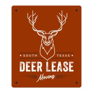
We have been working on a logo project for a new company called Deer Lease Moving (soon to be DeerLeaseMoving.com). It’s always interesting to see the iterations we come up with and to try to guess which one the client will like or not like. Here are three of the logos we presented to the client. Which logo do you think was selected by the client?

Drumroll …

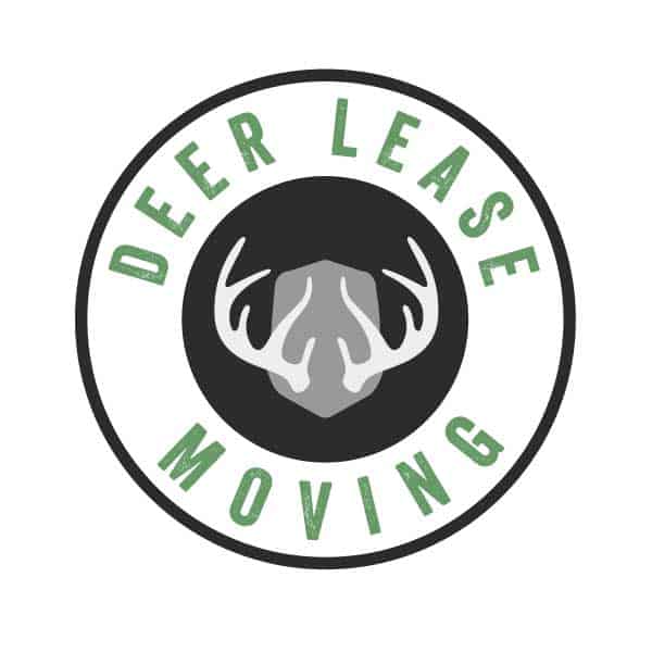
The client chose the simplest logo (the first one), which is the circular logo with black, gray and green. Around the office we were convinced they would select the mostly green circular logo, which actually was our favorite.

More logos

See more of our logo designs here.

Some new print stuff

By | great design, print design, website design | No Comments

Here are a couple of new print designs we developed recently for two different clients.

Retractable vinyl banner for Waterfall On Lake Travis

The first is a retractable vinyl banner, 32×80, that we designed for our client Waterfall On Lake Travis, a 36-unit luxury mid-rise condo on 950 feet of Lake Travis shoreline, slated for completion summer of 2016 (we also designed the website, waterfallonlaketravis.com). The client, Gene Arant Realty, wanted something biggish and splashy that they could take to locations and set up to make a statement in a room. The retractable banners stand more than six feet tall and the color and image reproduction is pretty nice.

waterfall-32x80-banner-72dpi

Postcard for Chase Flooring

A quick postcard we designed to attract builders to the Chase Flooring Design Center. This one is a luxuriously large postcard size at 6×9 inches. Printed front and back the print costs are surprisingly low per piece, even on small print runs.

print-chase-6x9-postcard-horiz-4

New design for Crossroads website now live

By | great design, logo design, website design | No Comments
Crossroads at Panadero Ranch

Crossroads at Panadero Ranch logo

Crossroads website features the beauty of Central Texas

Woody Creative designed the logo and the website for Crossroads at Panadero Ranch, a wonderful non-profit that shares the great outdoors and the word of God with deserving young boys. The Crossroads Ministry experience includes a weekend on Panadero Ranch, where the boys join peers and adult mentors for a weekend of camping, hunting and time for discussion and reflection around the campfire. Most of the boys have never experienced hunting and many have never been camping.

Crossroads at Panadero Ranch

Some new logos

By | great design, logo design | No Comments

We’ve been creating a lot of logos lately. A couple are below. You can see a whole bunch of logos on the Logo Design page.


Cheap photo service with great quality

By | great design, great tools, other, recommendations, Wordpress | No Comments

A cheap photo service we think you will love

Our clients often ask us, “Can you recommend a cheap photo service?” The answer is yes. But while a cheap photo service doesn’t always translate to “great quality,” this one is an exception. It’s called Dollar Photo Club, and the photos really do cost, you guessed it, $1.

Just one caveat

You will pay an up-front “membership fee” of $99, but that fee instantly gives you an account stocked with 99 credits, so you essentially are buying 99 one-dollar photos. We’re not here to sell you a bunch of crummy third-party marketing services, but when we come across a marketing resource that really is a rare and excellent value, we have to share it. Full disclosure is that, yes, we’re signed up (proudly) as an affiliate for these guys.

Photos and vector art that are top-notch

We think the quality of the photos and vector illustrations is as good as many of the other services that often charge hundreds of dollars per image. So if you want a cheap photo service or cheap vector art that is still pretty darn nice, check out Dollar Photo Club and we think you’ll be thrilled.


Cool postcard design for Cecropia Solutions

By | great design, print design | No Comments
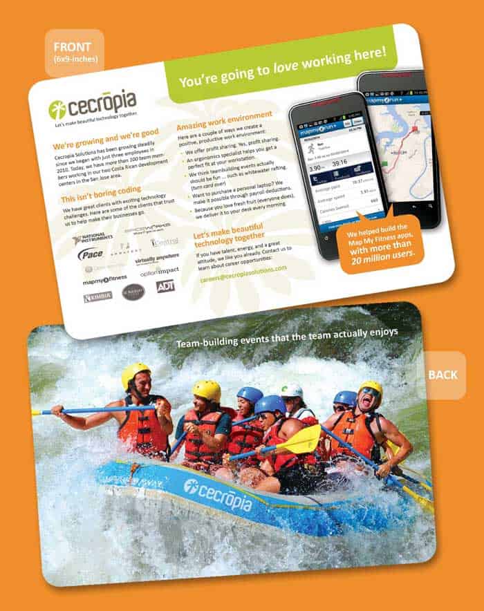
Cecropia Solutions postcard

Cecropia Solutions postcard

White water ahead

Our awesome, award-winning technology client, Cecropia Solutions, the builders of the Map My Fitness suite of mobile apps (with 23 million freakin’ users), asked us to create a cool postcard design to show how neat-o they are when they are visiting and recruiting and presenting at nearby universities. So we made this little baby. Kind of makes us want to go find some white water.

Looking for a cool postcard design? Call us.

Infographics best practices

By | great design, infographics, marketing consultant, marketing specialist, marketing writer | No Comments

Infographics best practices

An interesting and well-designed infographic that leverages infographic best practices can draw a lot of attention and improve search-engine optimization for your business. Here are a couple of tips.

1. Sketch it out first. The purpose of an infographic is to quickly communicate information visually because we all have frighteningly short attention spans and are too lazy to read. That might sound cynical — and admittedly, it is — but it’s also true. You have to get your point across quickly, and an infographic is a great way to do it, but you have to plan ahead and make sure your infographic is extremely clear. Sketch it out with pencil and paper before you open up Photoshop and Illustrator. (Note: Yeah, you’re gonna need to either be a good/great designer, or know where to find one. Stressed about this part? Reach out to us … I can help.)

2. Share it with three or four people and ask them if it makes sense.You’d be amazed at how many usability errors you can uncover just by sharing your infographic design with a couple of people. According to usability guru Jakob Nielson, you can discover up to 85 percent of usability issues just by sharing your design with 5-8 regular folks.

3. Represent the data in an interesting way. Don’t just slap down a bar chart that looks like it came from Excel. If you are trying to show that there are twice as many dogs than cats in the U.S. (not true), why not make a chart that uses little doggie and kitty icons? Also, consider being clever. It doesn’t mean you have to be hilarious, but if you can thrown in a clever Justin Bieber reference (see Reason No. 3 in the infographic below), that never hurts.

4. Guide the reader through the infographic. Use some kind of combination of numbered steps or arrows and dotted lines to walk the reader through the proper flow of the message. An otherwise great message can be confusing if the reader doesn’t know where to start and where to proceed. If you give them a clear path to take, they will follow it. (And, as Yogi Bera said, “If you come to a fork in the road, take it.”)

5. Don’t get lost in the design. As a designer of infographics, I recognize the temptation to go a little nutty with beautiful and rich graphics, but don’t just create cool artwork for the sake of showing off. If the graphic element does not contribute to the quick and simple communication of the message, ditch it. Lead with data and always design around that premise.

Looking for something like this to promote your business?

Check out the infographic design I developed (below) to promote Woody Creative. Interested in having something like this created to promote your business or service or product? Woody Creative does amazing infographic design. Contact us to discuss what you are trying to accomplish, and let’s create something that will help people recognize your expertise and draw some attention to your business.

Let us use infographics best practices to help promote your business

Yep, we can create one of these to help your promote your business or service or expertise. Give us a call for a complimentary brainstorm on what you are trying to accomplish for your business. We do marketing consulting and online marketing. Not only are we are good at it, but we’re super easy to work with. Call us.